


7 Illustration Tips for Dyslexia
Making your design and illustration more accessible

A wee while ago I was approached by the V&A Museum to live illustrate some sketchnotes for their Youth Collective.
They were the first ever client to specifically request dyslexia-friendly illustrations, so I went on a research mission to find out what that really meant.
Here are my findings for you (+ an audio version above, for even more accessibility points.)
The British Dyslexic Association’s definition of dyslexia is: ‘A learning difficulty that primarily affects the skills involved in accurate and fluent word reading and spelling.’
Ten percent (10%) of the population are dyslexic; 4% severely so. Dyslexia is hidden and as a result, dyslexic people overcome numerous challenges to make a full contribution to society.- Dyslexic Design
https://cargocollective.com/DyslexicDesign/Dyslexia
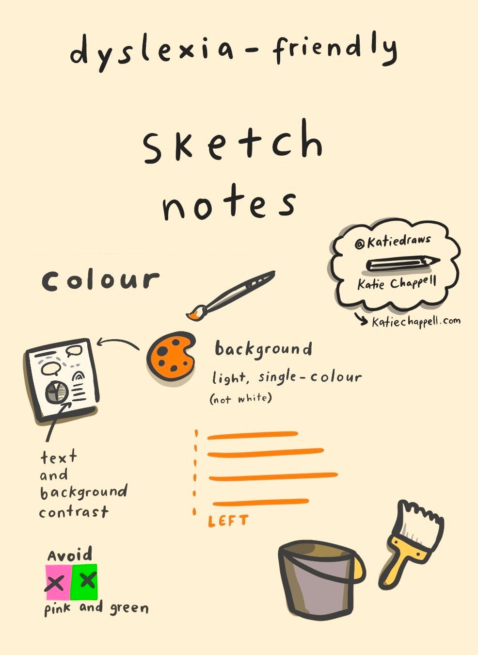
1. Bright white as a background is too dazzling, and that can make it really difficult for people with dyslexia to read.
So any off-white colour is good. So for this actual live illustration gig, I used a lot of different colors to experiment. And the sort of creamy off-white was like the one that I preferred the most. I haven't actually spoken to any of my dyslexic friends yet to test which one they preferred, but it's all good.
Another thing that I discovered in my research was that…
2. It's important to have a contrast between the background and text colour.
Eg a dark text on a light (not bright white) background is good. So there really is enough contrast between the background and the foreground.
3. Avoid pink and green, for colourblindness.
Those colours can really make things difficult.
4. Left-aligning text can help dyslexic people to read
It’s easier to read if the lines all begin in the same place. Stay away from centre-aligning text. Left-aligned text is much easier to read, even if you don’t have dyslexia. When the lines of text all start from one margin, it saves your eyeballs from having to jump all over the place.
5. Double-space your lines
Spaced out = easy to follow and accessible for everyone. Because I'm a live illustrator, most of my notes are actually pictures rather than words, but when I do use words, I make sure to leave a nice double space between the lines.
6. Open, friendly fonts (like Comic Sans) can be easier to read
Designers are always very snobby about comic sans, but keeping your handwriting clear, legible and close enough to Comic Sans means you know it’ll be easy to read.
It's also important to…
7. Use lowercase or sentence case
Sentence case makes it easier to recognise letterforms for people with dyslexia. No ALL CAPS SHOUTING PLEASE.
Weyyy, you’re all set to make more inclusive, accessible illustrations now.
If you’d like to learn more about my work, here’s a nice yellow button to take you there.